
Some Friday Cover Process
or, "Let me tell you about MY problems..."

Thought it might be fun to go through a lot of the process I go through from start to finish… and if you’re just here for some cool art, well, there’s plenty of that too. Scroll away!
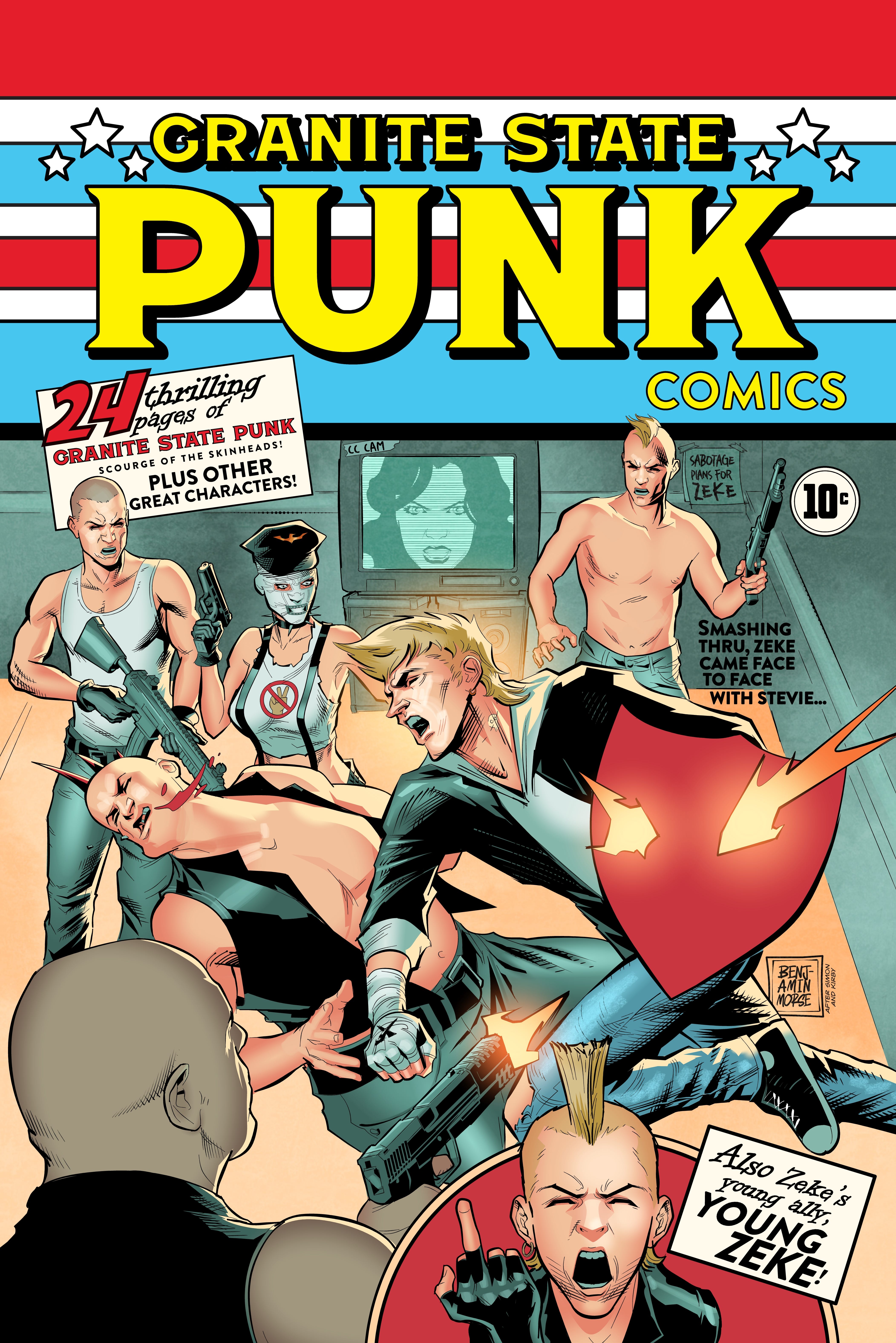
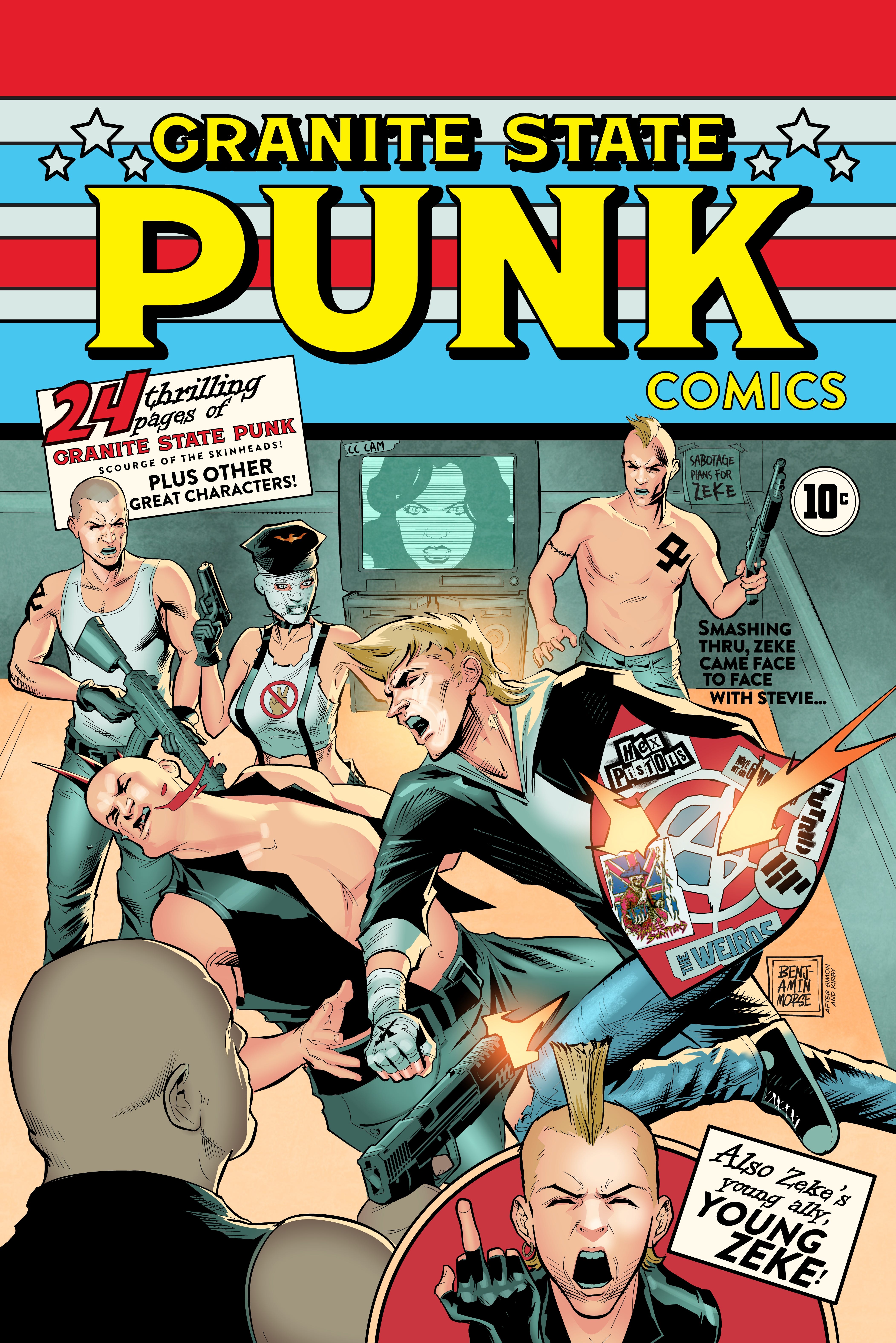
Just wrapped up a homage to Simon and Kirby’s Captain America #1 cover for Travis Gibb’s Granite State Punk! Was really unsure tacking this one- I wasn’t sure how well the colors and setup of that cover would work in my style.
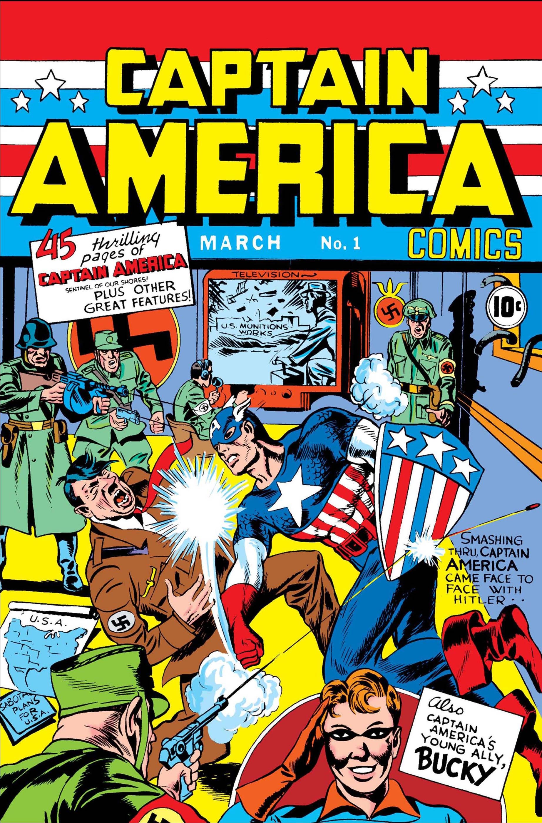
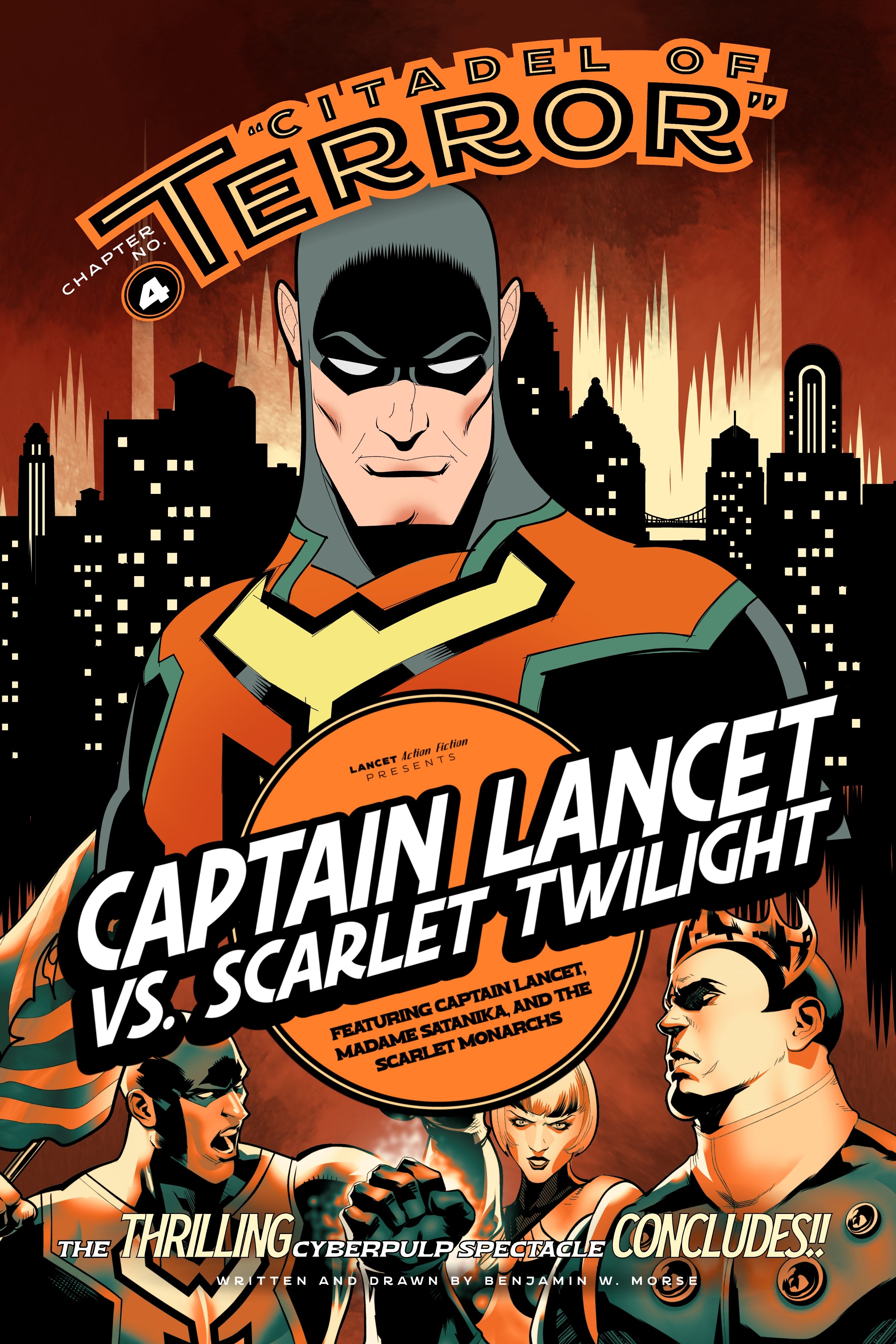
It’s iconic, of course- a great image. But it has a TON of stuff that’s tough to update while keeping the spirit of the original. Travis wanted to keep this in the realistic style I usually work in, which took away a lot of options to gloss over some stuff that was hard to work with. If I’d done it like the top section of the cover below, sort of a tribute to Dick Sprang and Jerry Robinson (which I love to do), I think it’d have been a lot easier:
But ok, realistic it is. Decided to think about setting that up while I worked on the trade dress. Everything but the title was pretty easy to translate. The “Captain America” up top though, was tough. That font isn’t really too easy to emulate, and it’s one of those that only looks good when it says “Captain America” in the way we’re used to seeing it. And for wording, “Granite State Punk” is tough to shoehorn in there. If we did Granite on one line and State Punk below, it’s come close to the same shape stacked as Captain America, but that doesn’t read really well- I think “Punk” needs to be the big statement. So I went with a different font- one that I could have take up the space well enough, separate the words in a way that read well, and then at least seemed to suggest the 40’s time period. After that, I got started setting up the rough layout for the art.
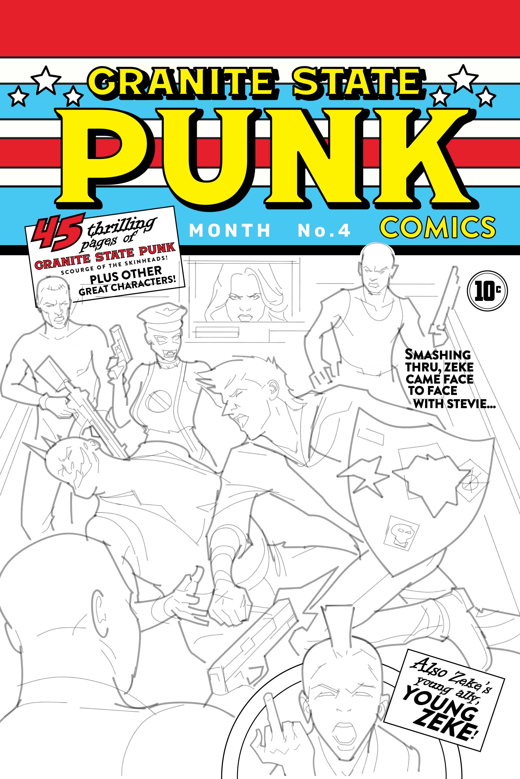
I went as far as setting up some stock figures in a 3d space just to make sure my scaling was ok- if you really dig into the Cap cover, the scale and perspective doesn’t quite check out- which looks fine if things are really retro and cartoony. More realistic… it really stands out. So I rescaled my figure sketches based on that, and got drawing.
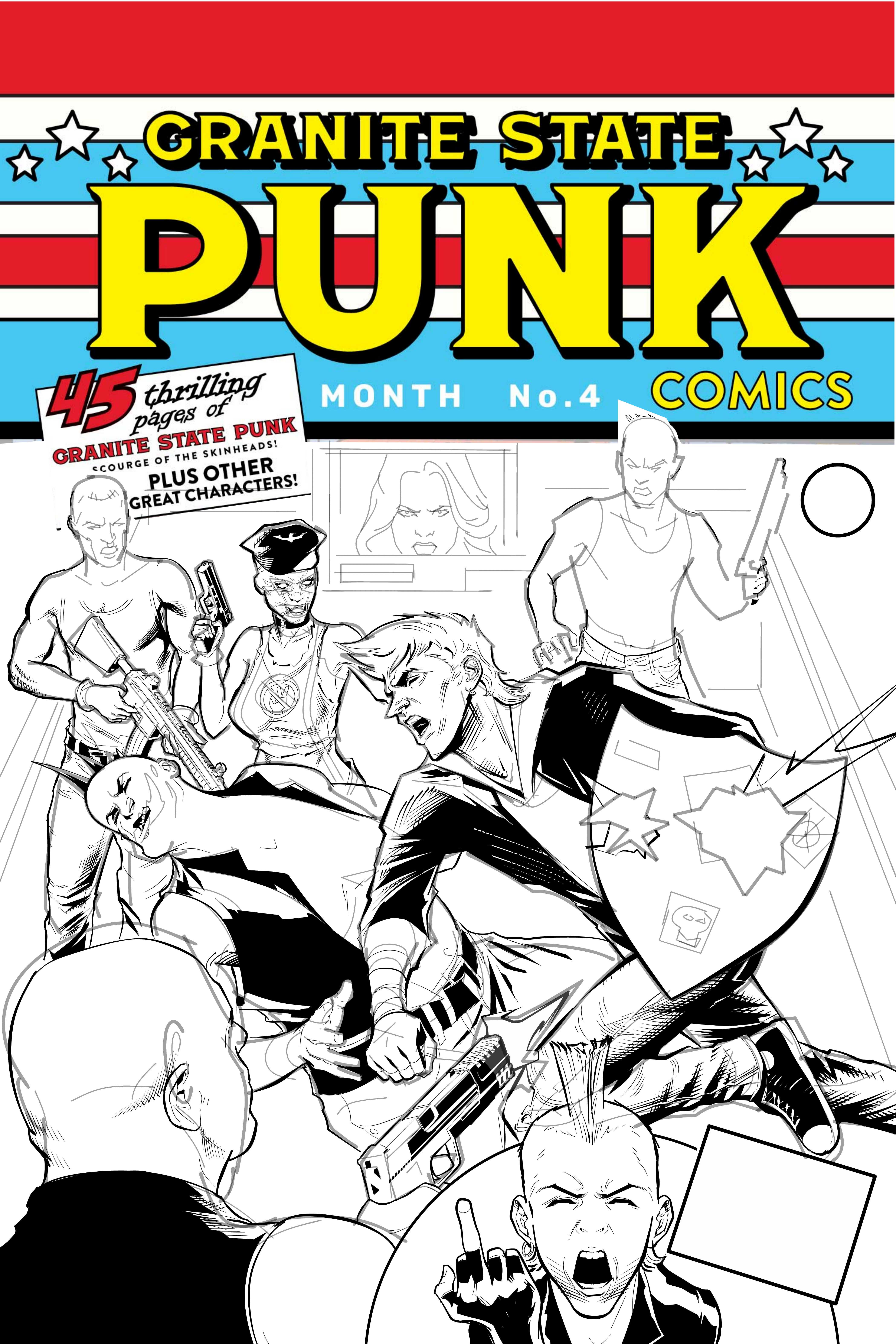
Then came the thing I was really worried about- color. That color scheme in the original is wild. Totally surreal, and yet if I made it look like a “real” room’s colors, I think it’d seem really dull by comparison. After all, when you see my cover, the memory of the original is going to be right there in your mind’s eye. My first idea was to just take the cool tone wall and the vivid yellow floor and tone it down. And… that worked out. Whew. Nice when that happens!
Almost done- but I needed to create some fake band stickers for the shield. I’d have made some stuff up, but if you read Granite State Punk, the main character, Zeke is always calling out people’s bad taste in music. I pretty much listen to Van Halen, Rush and Jimmy Buffet, so… I didn’t think I’d be the best person to pick out the bands we based those on. After getting a list of bands to emulate from Travis, I started working some stuff based on stuff Zeke would like.

After I added those and an anarchy logo to the shield itself (Travis’ idea- a great one that made it a lot more like Cap’s) that pretty much wrapped it up!
Hope you liked seeing how this one came together- and you can check out the book here! Should launch next week!
Until next week,
Ben
Thank you for sharing your process for this cover! It was very cool to see your take on such an iconic image. I can’t wait to support this project when it launches!